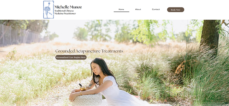
Your wellness journey starts here.
I created a new website promoting a Traditional Chinese Medicine practitioner based in Pleasanton, CA. The practitioner's name is Michelle Munoz, and the business is KIN Medicine. The website should highlight her focus on grounded, personalized acupuncture treatments that support the nervous system, hormones, emotional wellness, and overall health.
TIMEFRAME:
6 Weeks (100 hours)
ROLE:
UX/UI Designer
PROJECT TYPE:
Desktop Website
TOOLS:
Figma, Figjam, Optimal Work Shop, Zoom
Discover with Research
Competitive Analysis
Compare and contrast existing apps and websites to see what already works well and any features that could be improved.
Main Take Aways:
Accessibilty:all sites made easy access menus on their home pages
Branding: All sites maintain their branding on all pages of their site
Recommendations:
Readability: A lot of their sties have thin fonts and colored backgrounds that clash, making the content hard to read
Consistency: Some buttons move on some sites making it confusing for users

User Interviews
I interviewed a total of 4 people with a range in demographic. This allowed for us to get a better idea of what multiple people prioritize so we can hone in on what is most important to potential clients.

Demographic
Ages 24 - 63 years old and 3 different ethnicities.
Experience
All have dealt with online health care and are all familiar with acupuncture and holistic health.
Interview Debrief
I was able to gather the feed back by using a chart with all of the people I interviewed. This made it easier for me to look for details at a glance

Defining the Problem
Affinity Mapping
We were able to create an affinity map based off the survey answers and identify the key points that user's struggle with when choosing a health care provider.

We were able to create an affinity map based off the survey answers and identify the key points that user's struggle with when planning trips. The results were categorized based off of how often people shared this same issue or concern. In this case client reviews, navigation and credentials are the most common.

POV's and HMW's
Summarizing the main pain points from the collected information to find solutions.

Point of View
Michelle would like to provide clear credentials displayed on her site or somewhere it can be accessed by potential clients.

Point of View
Michelle wants to achieve an easy to use website so clients of all ages are able to navigate.

Point of View
Michelle wants there to be a portion that allows for us to add client reviews when they become available.
How Might We?
How might we ensure Michelle’s credentials are easily accessible?
How Might We?
How might we create an easy to read menu navigation bar?
How Might We?
How might we create a layout that allows for changes to be added later for client reviews?
User Personas
These personas will give us a quick background of who our potential users are, where they’re coming from, and what their top needs and pain points are.

Design with Solutions in Mind
Ideate: Information Architecture
From these tests, we got a better understanding of what features were successful, important, or not important. The card sorting tests specifically helped us narrow down the amount of features we planned to include.

Task Flow
Having the user personas and analyzing the information from our information architecture, we were able to narrow down what tasks we wanted to prioritize working on.

Using low fidelity wireframes, we are able to generalize placements and organization without spending too much time trying to perfect anything. This is best for brainstorming and getting ideas out.


Wireframing: Mid Fidelity
After testing out multiple versions of low fidelity wireframes and receiving feedback from multiple sources, this allowed for us to further solidify what we want for the final product.
This allows for us to focus on bigger picture more than the details like color or fonts.


Visual and Brand Design: Mood Board
At this point, we wanted to make decisions on the brands look and its pillars. Galavant prioritized being inviting, adventurous, fun, useful, and evoke the want to explore!


Deliver Prototypes
Usability Testing: Hybrid Method
Testing out how user’s respond to the current design.

In Person Testing and Results Summary
I conducted in person testing and recorded any feed back during and after. From there I was able to summarize key pain points to make improvements.
I created a revised and improved version to deliver a better experience for the user’s.
Usability Testing: Analysis and Prioritization
I analyzed the feedback to better understand the pain points and how I could best find a solution. From the charts previously, I have a clear direction.

Iterations
This is where I made some adjustments to the high fidelity wireframes. This allowed for improvements in final design.
Add Social Media Links
We received feedback that there were no social media contacts.
I added social media icons and links that are easily accessible on any page. This allowed for potential clients to see her work.


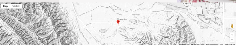
Add Visual Map Location
During usability testing, I heard user’s ask about the location as a thought out loud.
This gave me the idea to include a visual map on the contact page so it was clear at a glance the general location of the clinic.
Add Additional Call to Action Buttons
Looking at other websites of clinics of the same practice, I saw that their call to action buttons were large and repetitive.
After the usability tests, users stated it would be more convenient if at each point of the page they could book an appointment. Therefore, I added them through out the landing page.